[Disclosure: This post contains some Amazon affiliate links for certain items.]
In the spirit of sharing more love and light, I wanted to share one of my summer projects that I am super proud of…
 Photo by Kim Johnston Photography Invite madebymamaleh
So, my dear friend Rachel got married in August, and I had the joy and privilege of playing wedding planner extraordinaire. It’s funny what sets the stage for wedding design – sometimes it’s a special place or memory, sometimes a beloved heirloom and other times, something else that just speaks to you. When Rachel got engaged, nothing was predetermined and so we went dress shopping with nothing other than the spirit of discovery. But then THE DRESS revealed itself and became the inspiration for all else that followed. Rachel’s exquisite lace gown, lined in soft blush, with a sort of art deco vibe from the shape and lovely scalloped lace really set the tone from everything from the wedding invites to flowers to cake.
 Photo by Kim Johnston Photography
 Photo by Kim Johnston Photography
 Photo by Kim Johnston Photography; Cakes by Deep Sea Sugar and Salt (The London Fog is ah-mazing!)
I walked into Paper Source without much of an idea other than knowing that their Luxe Blush would be the perfect color! But then I spotted this gorgeous copper scalloped Nepalese paper and I just knew it would be just the thing to give these invites a wow factor! The photos only do it partial justice. As I showed Rachel the pile of paper and envelopes, she just nodded, thinking I was totally crazy.
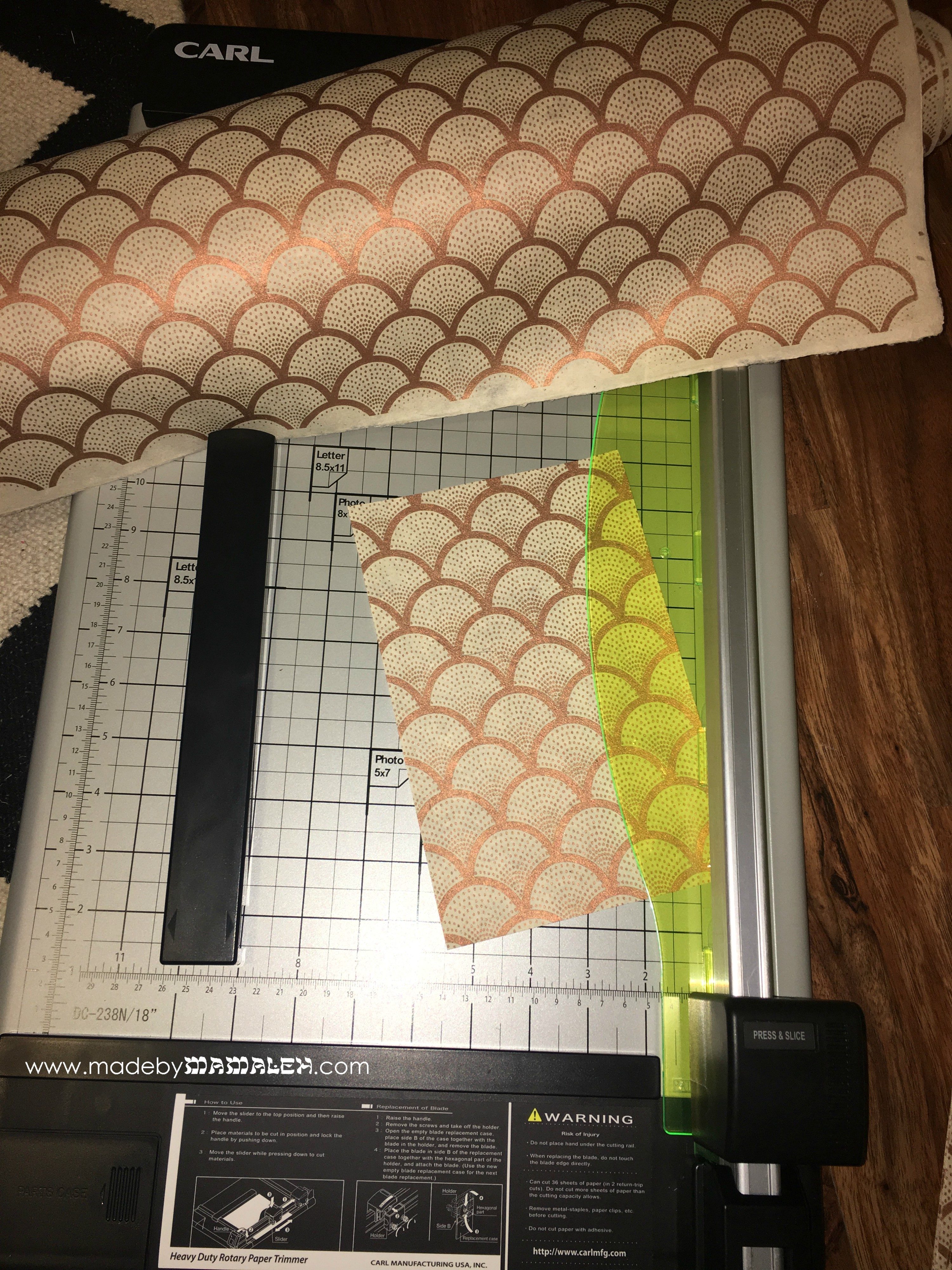
Working from an A9 (5.5″ by 8.5″ or a half sheet), I used Luxe White Cardstock for a base (and printed RSVP details on the back for single card simplicity). Then, using my heavy duty large scale paper cutter, I was able to cut 9 A9-sized pieces from each large sheet the Nepalese paper. I think A9 is an elegant size for wedding invites, especially where you are not including separate inserts for RSVP, etc. Once cut, I adhered these to the front of each invite using a tape runner and then trimming as needed.
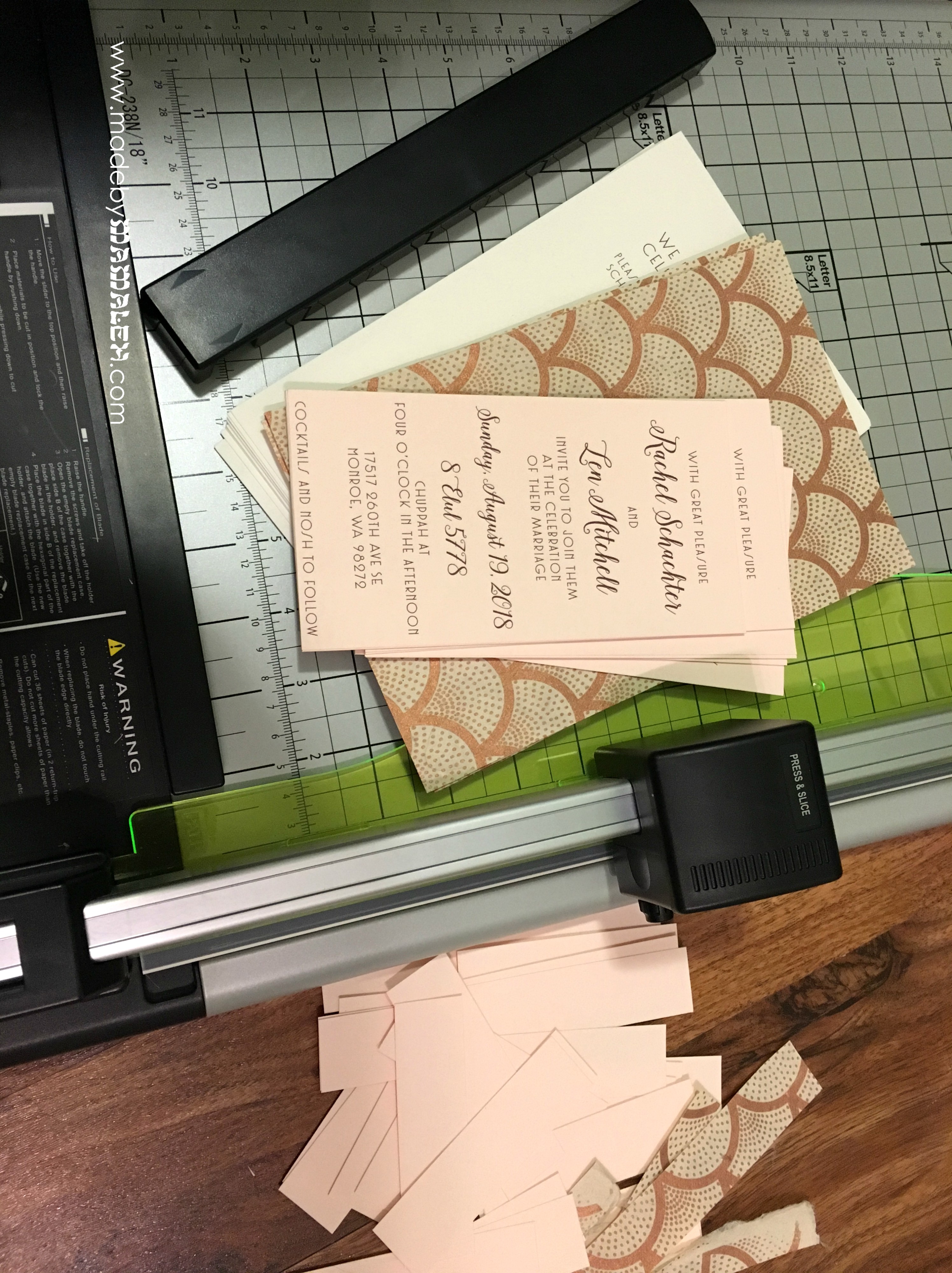
For the invite wording itself, I created a template in Microsoft Publisher that would allow for as much of the scalloped paper to show through while still providing plenty of room to write – so the printed area was 3.5×6.5 to allow a full inch all the way around. I printed this on the 60 lb. weight of the Luxe Blush in a deep brown color (RGB = Red 93, Green 45, Blue 52) using Isabella and Core Deco fonts (I somehow managed to get Core Deco for a super reduced price so keep your eye out for a deal). The combo worked perfectly and I used it for addressing the A9 Luxe Blush Envelopes too and then finished it all off with the perfect postage stamp (since amazingly this weighed in at just within single stamp range)! Mamaleh tip: we were able to stick to the theme of the wedding while still adding a few Jewish touches by noting the Hebrew date in addition to the secular one, noting time for the chuppah instead of just saying ceremony and use of the yiddish word “nosh“.
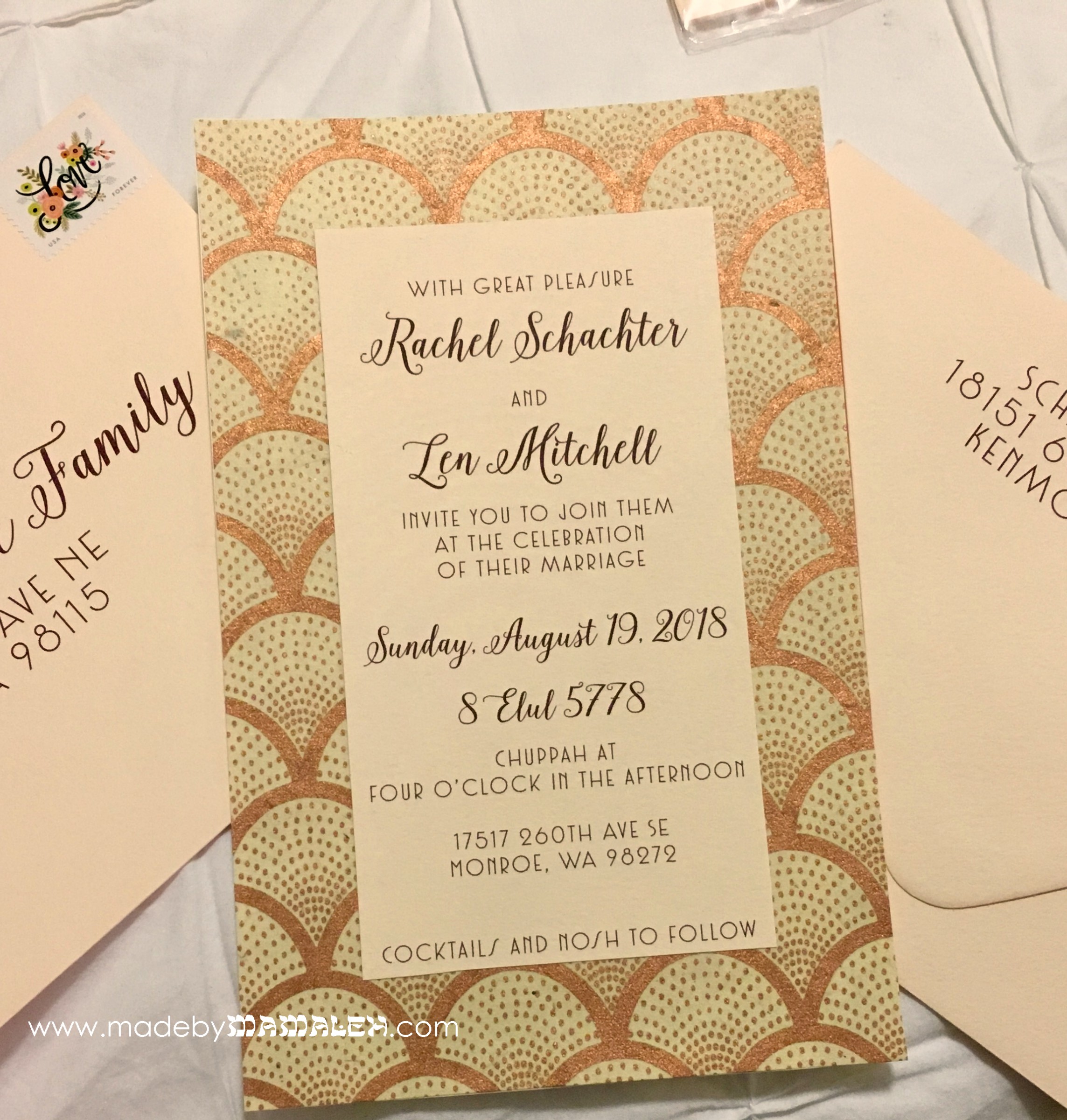
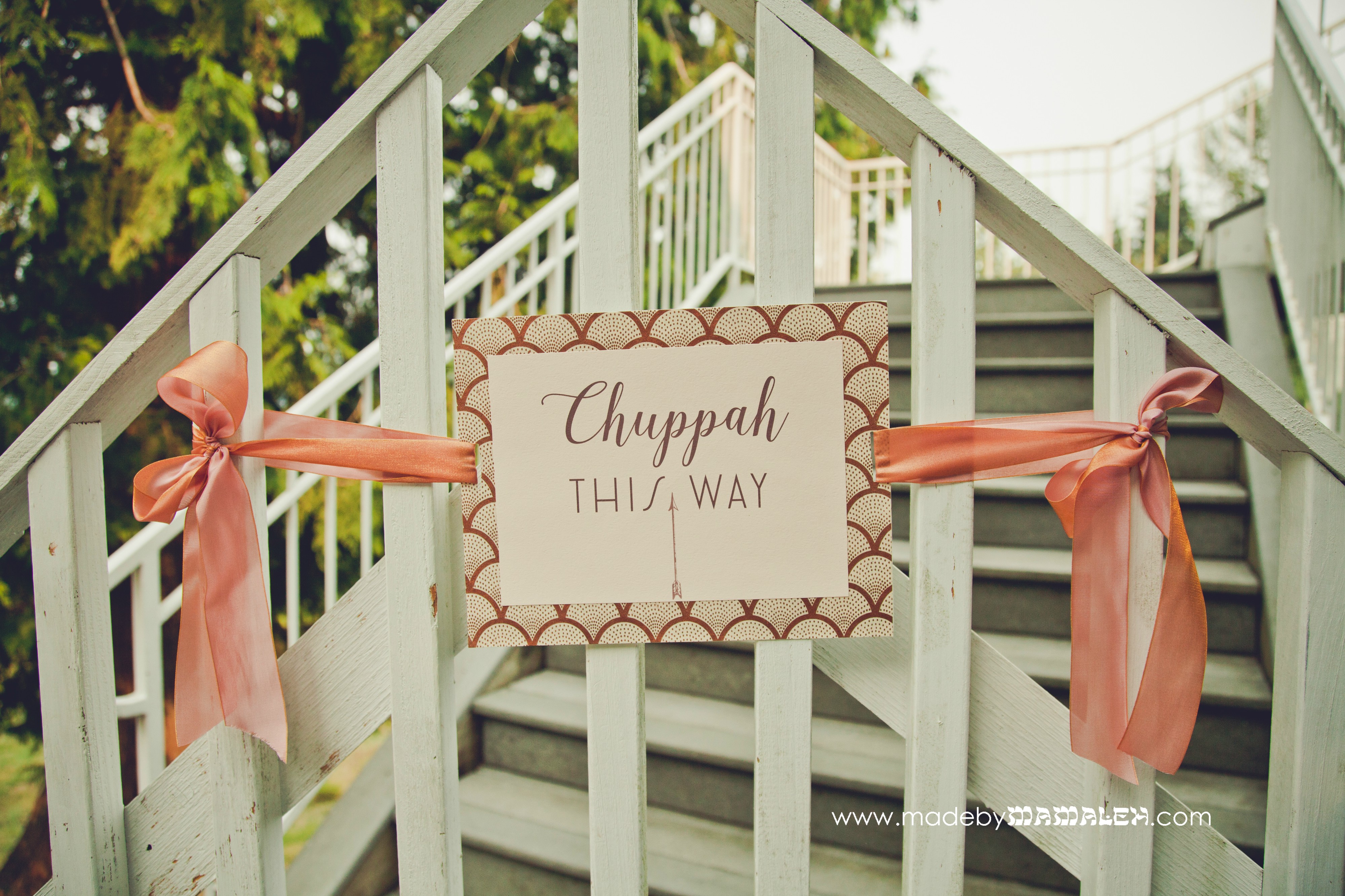 Photo by Kim Johnston Photography
Finally, beyond the invites, I was able to carry the same technique forward for the wedding signage including directions for the Instax guest book! Simple and chic and full of love and light!
 Photo by Kim Johnston Photography
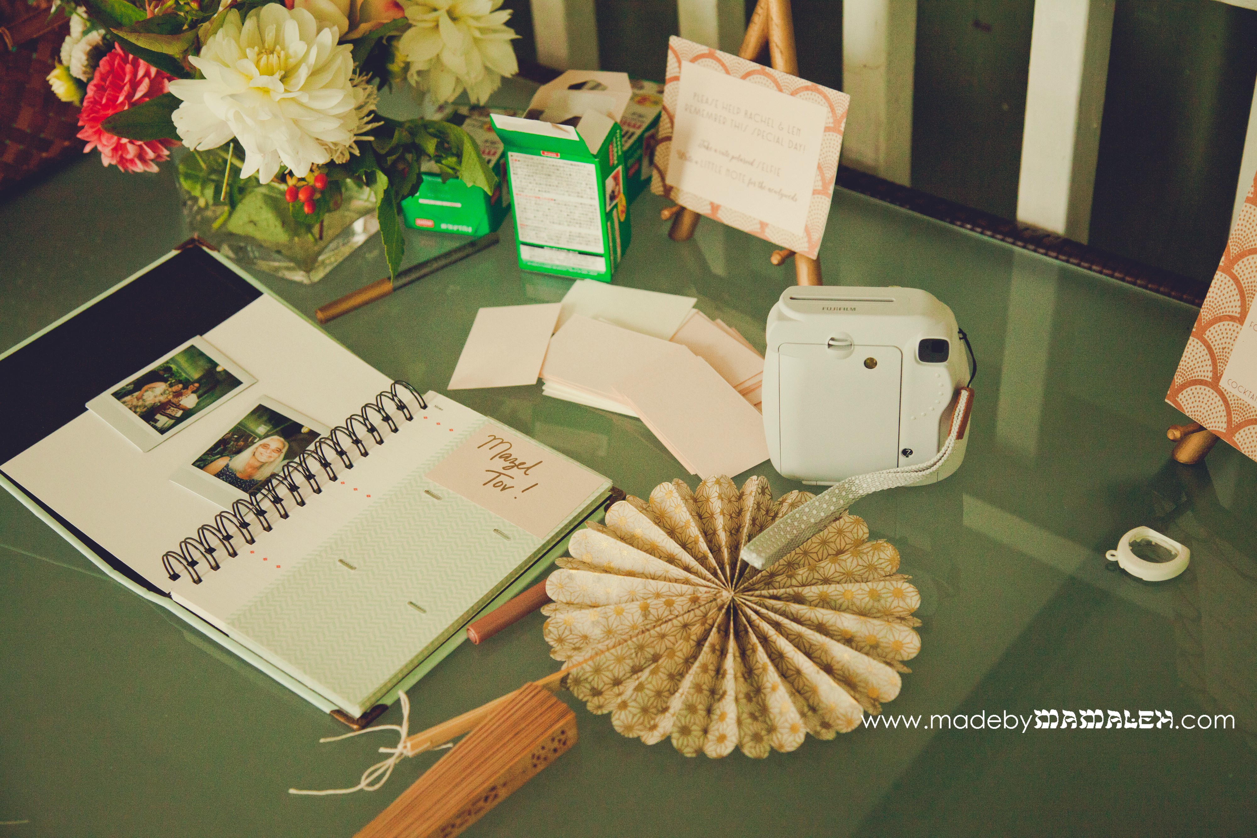 Photo by Kim Johnston Photography
